Product design people love to use.
UX and UI design for SaaS, apps and platforms. We research, design and test with real users. Then our own developers build it too.
- 5.0 on Google, from 49 reviews
- 150+ projects
- 14+ years of experience
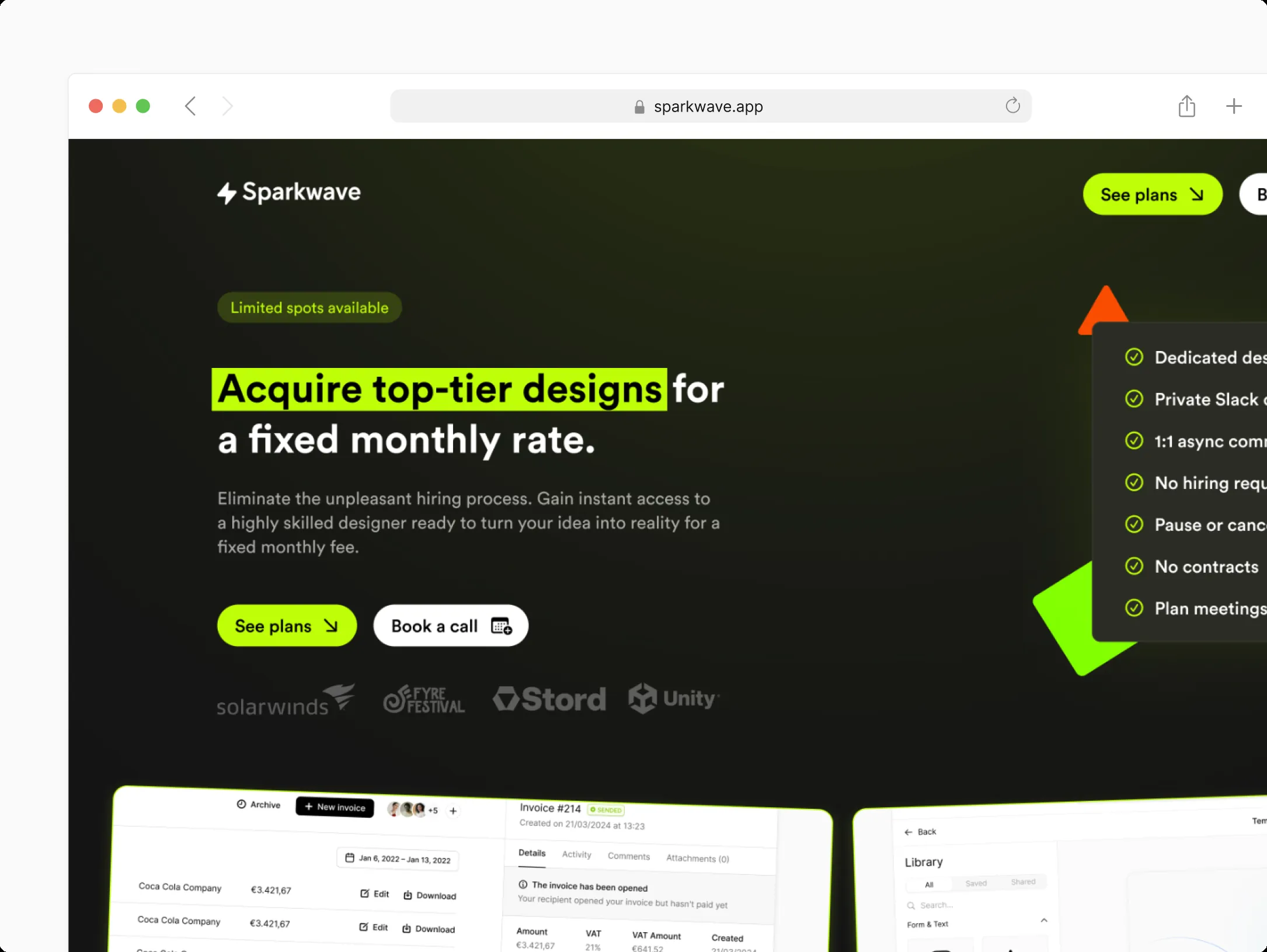
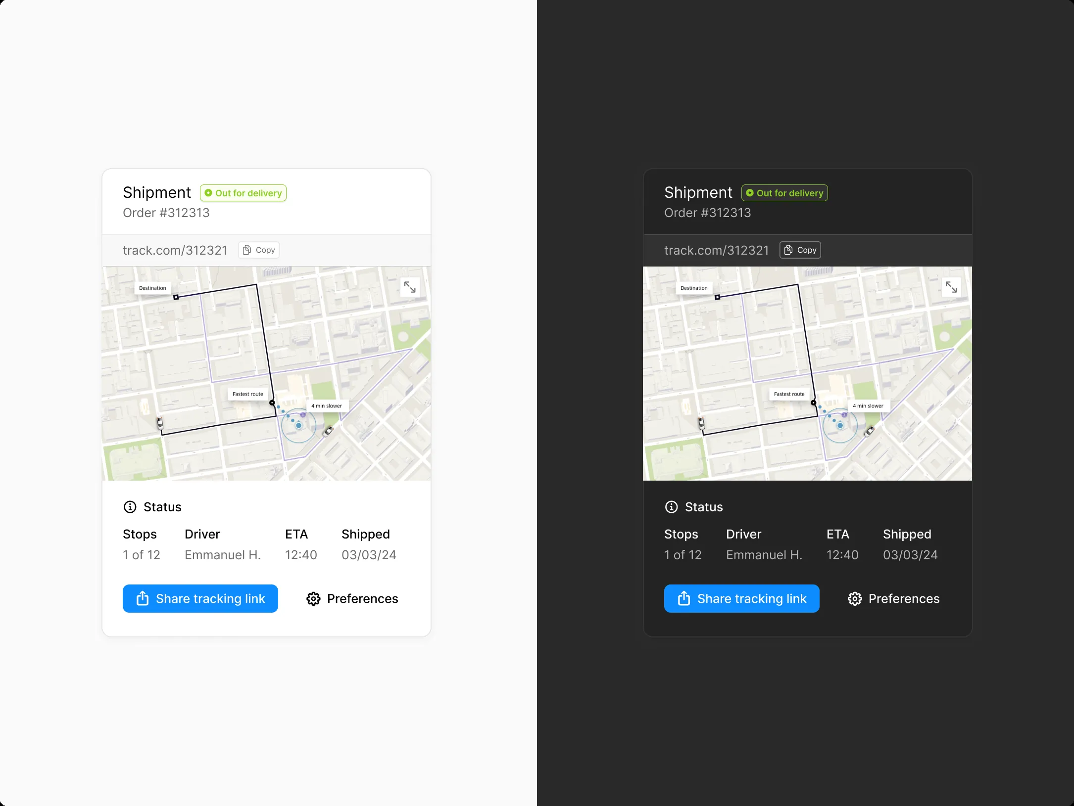
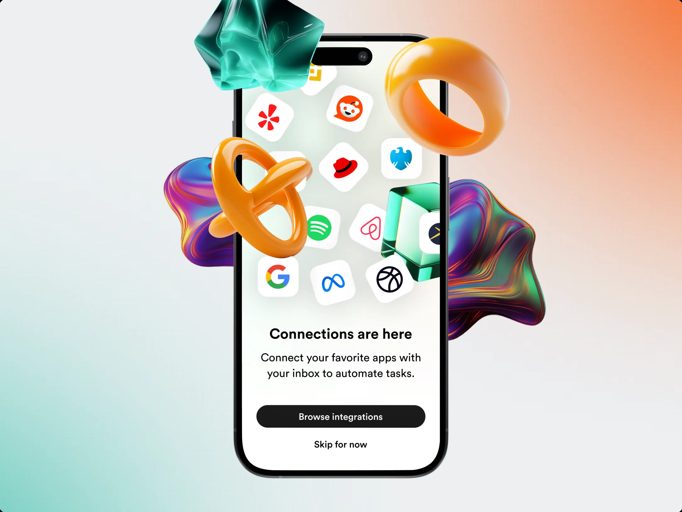
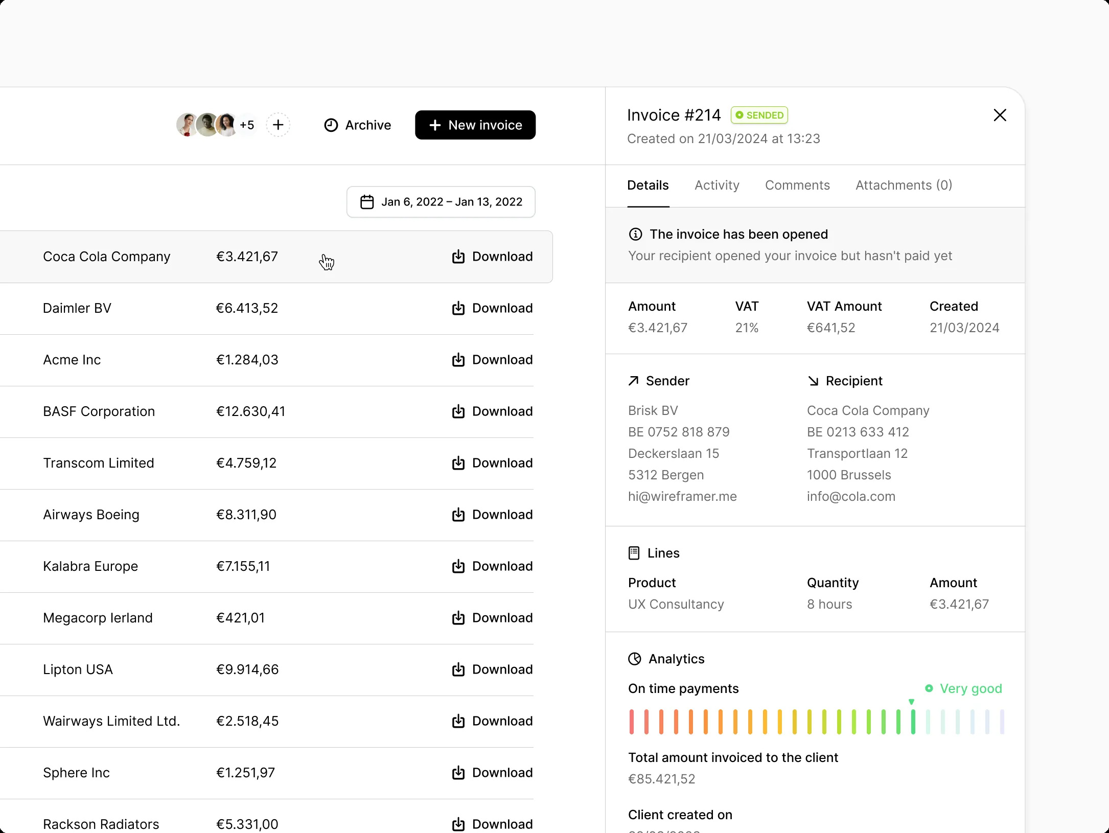
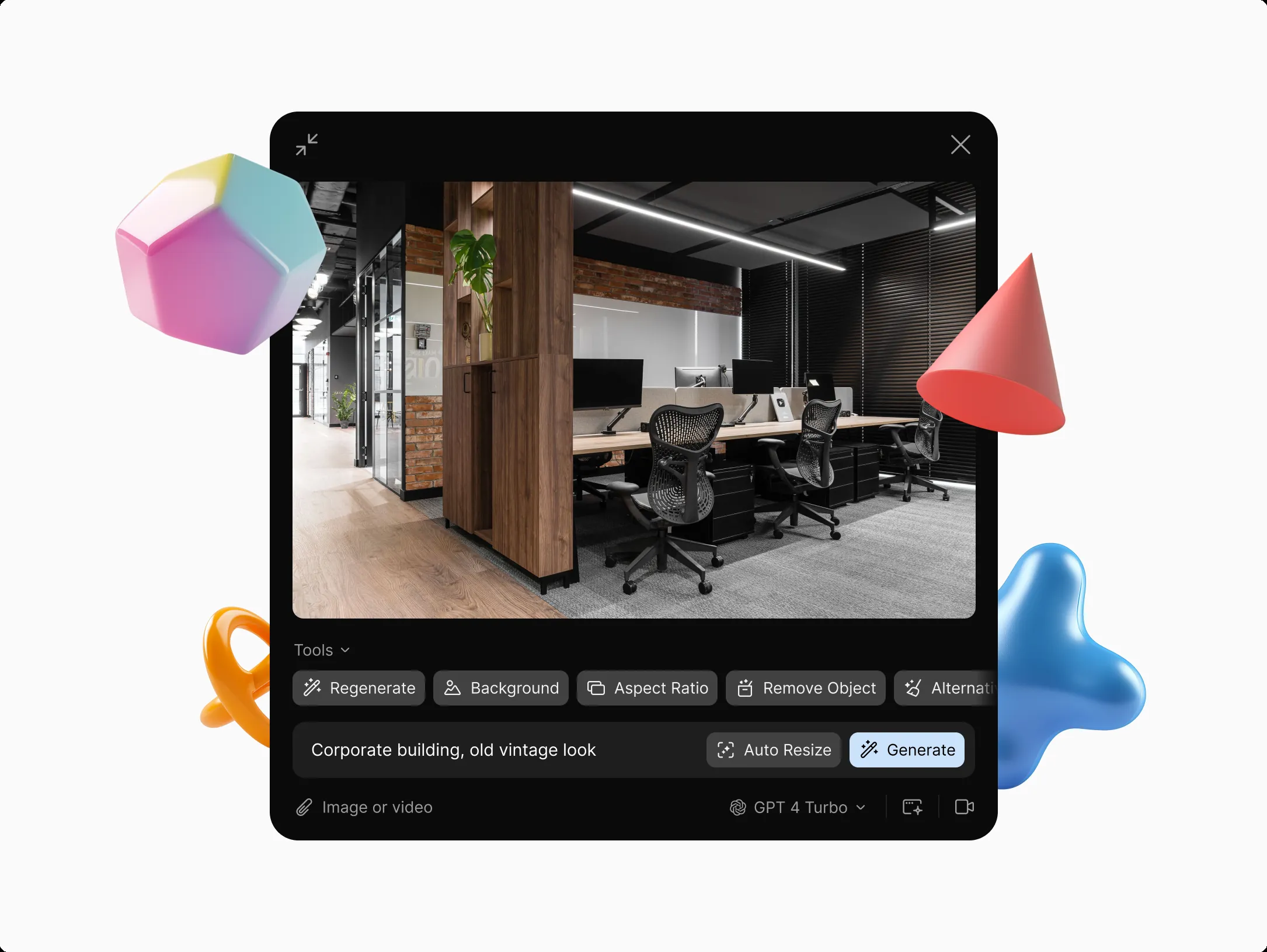
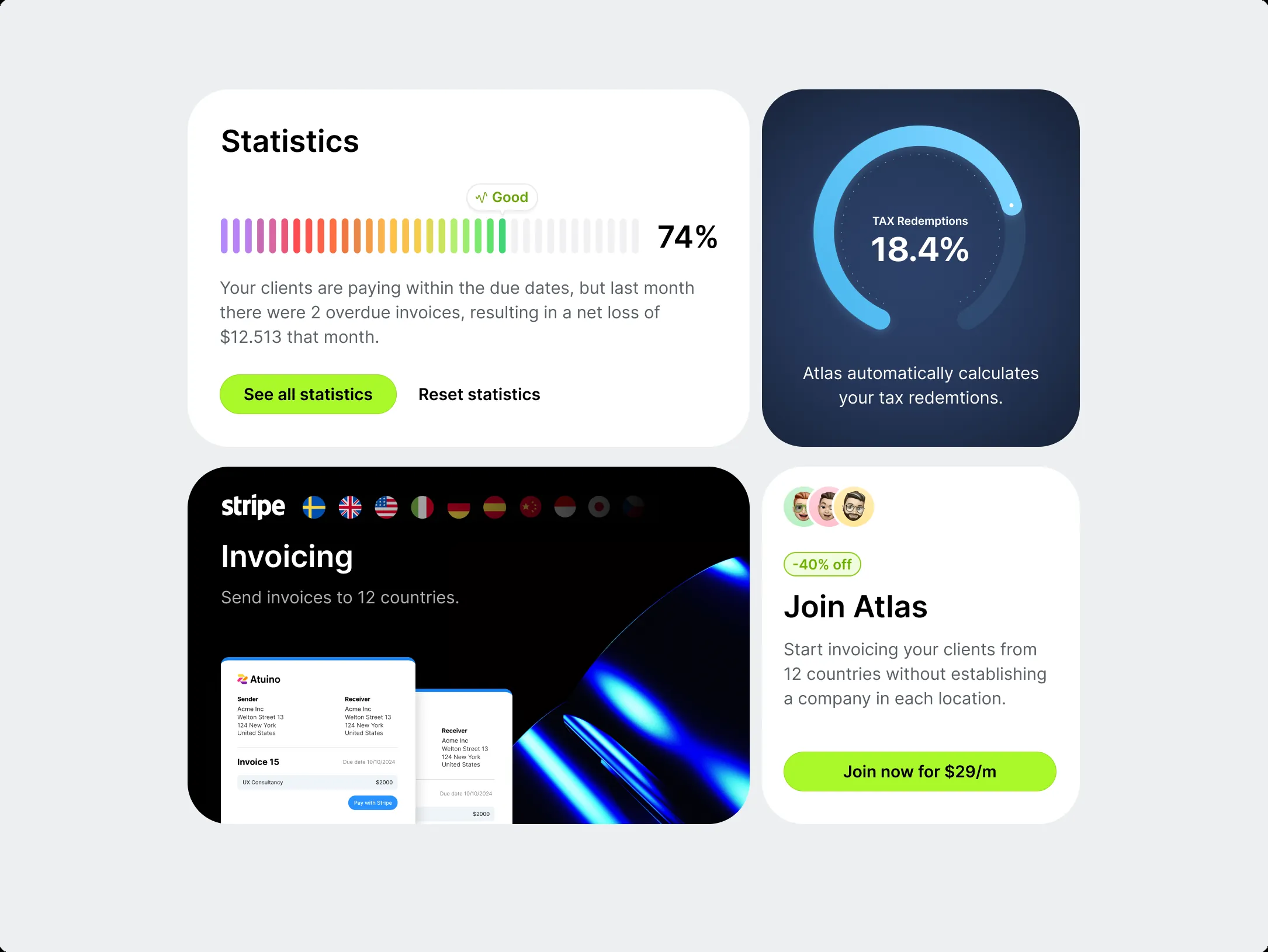
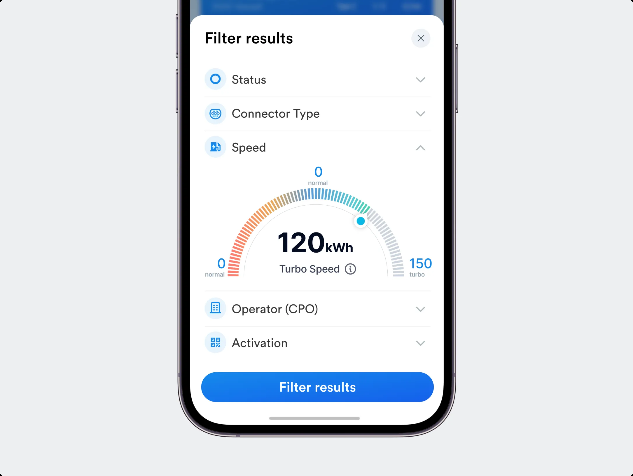
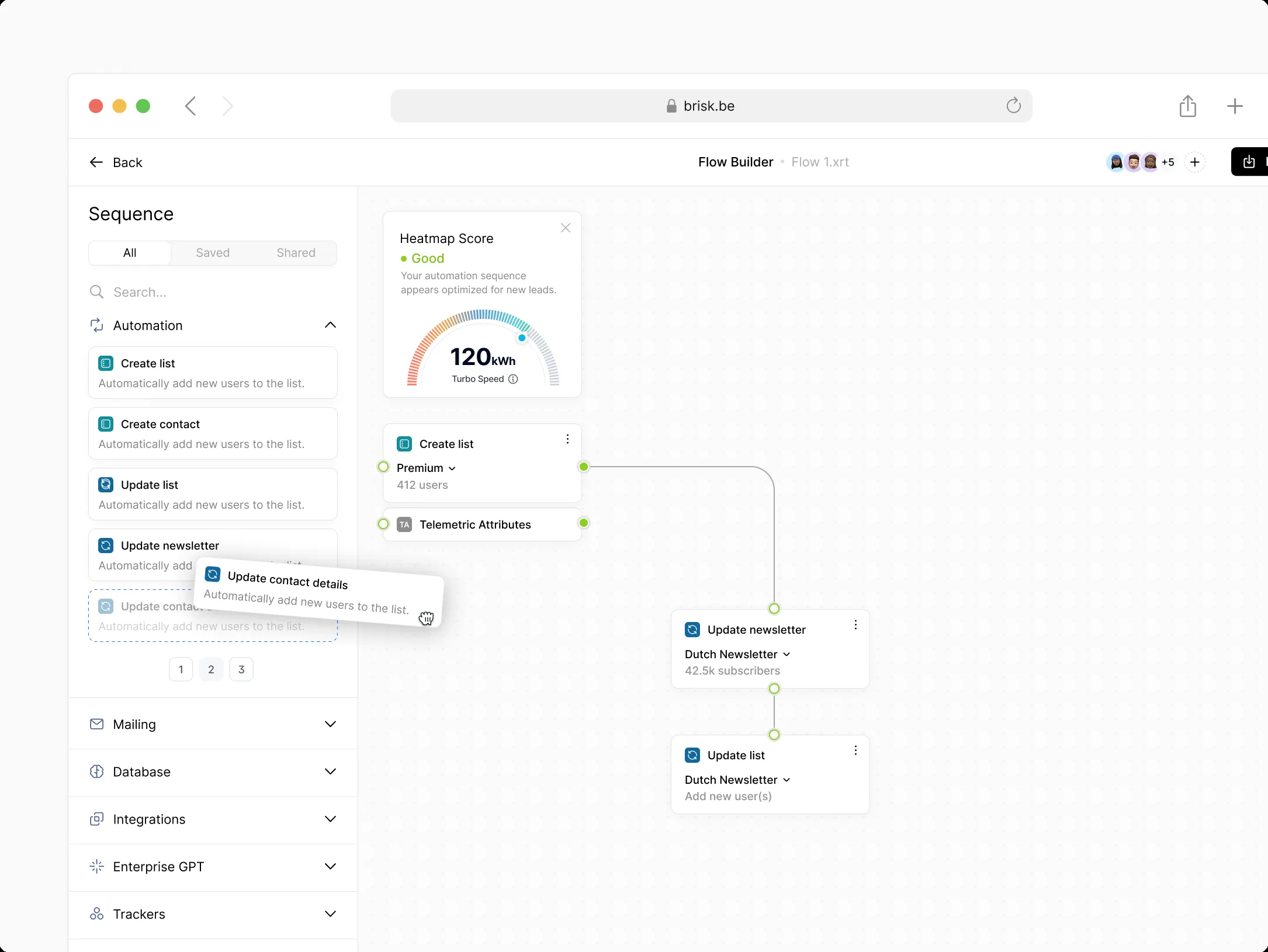
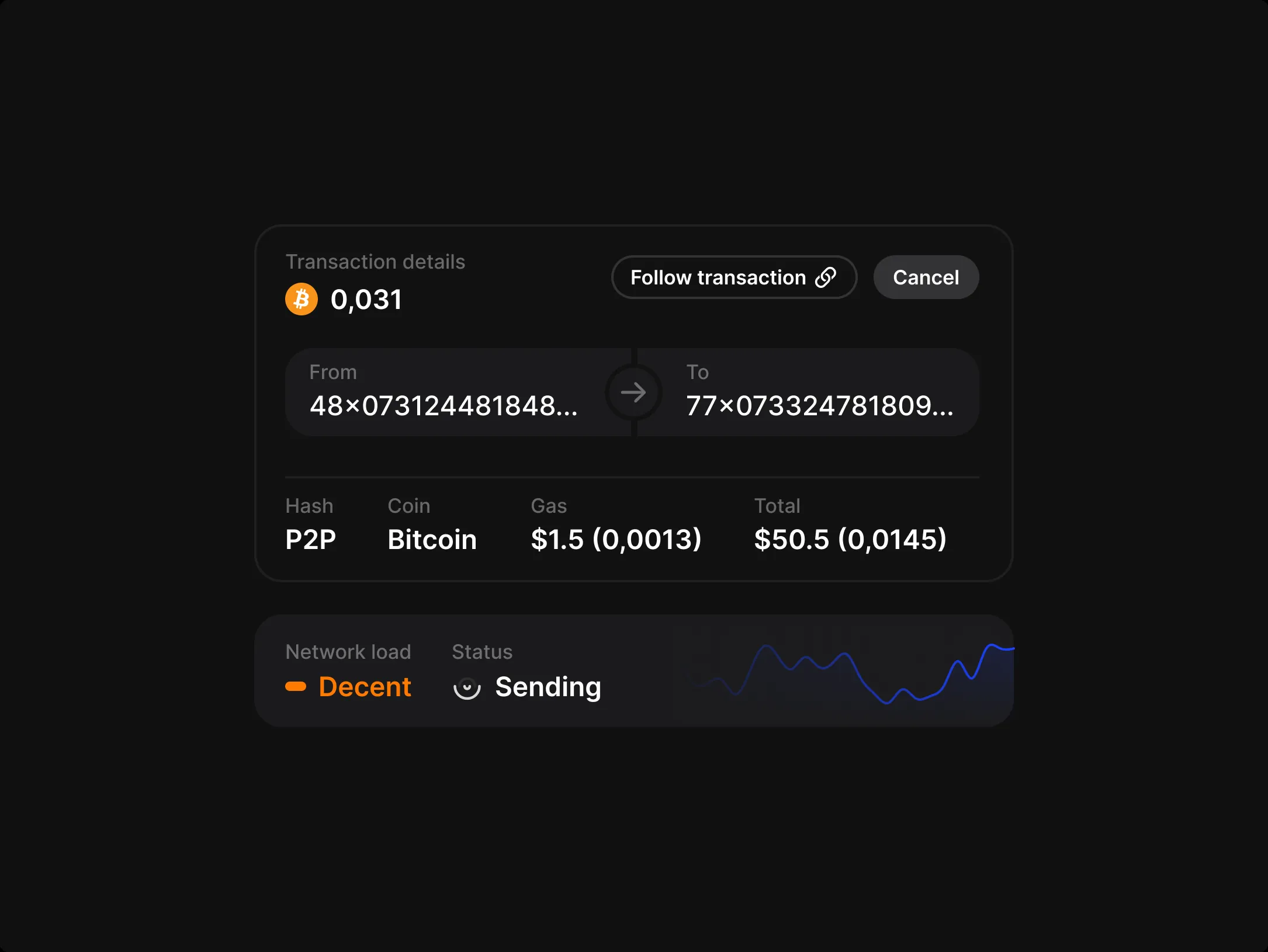
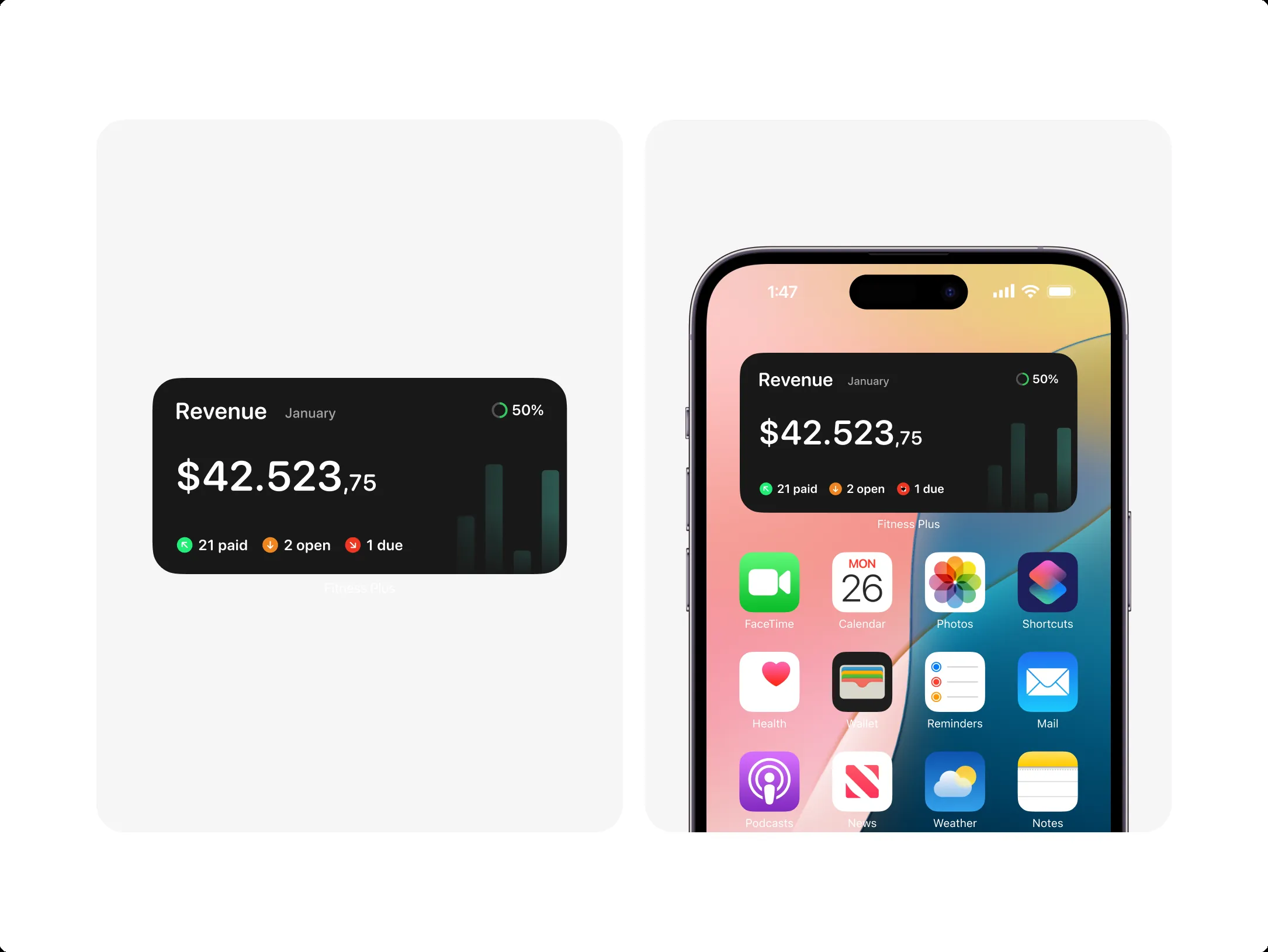
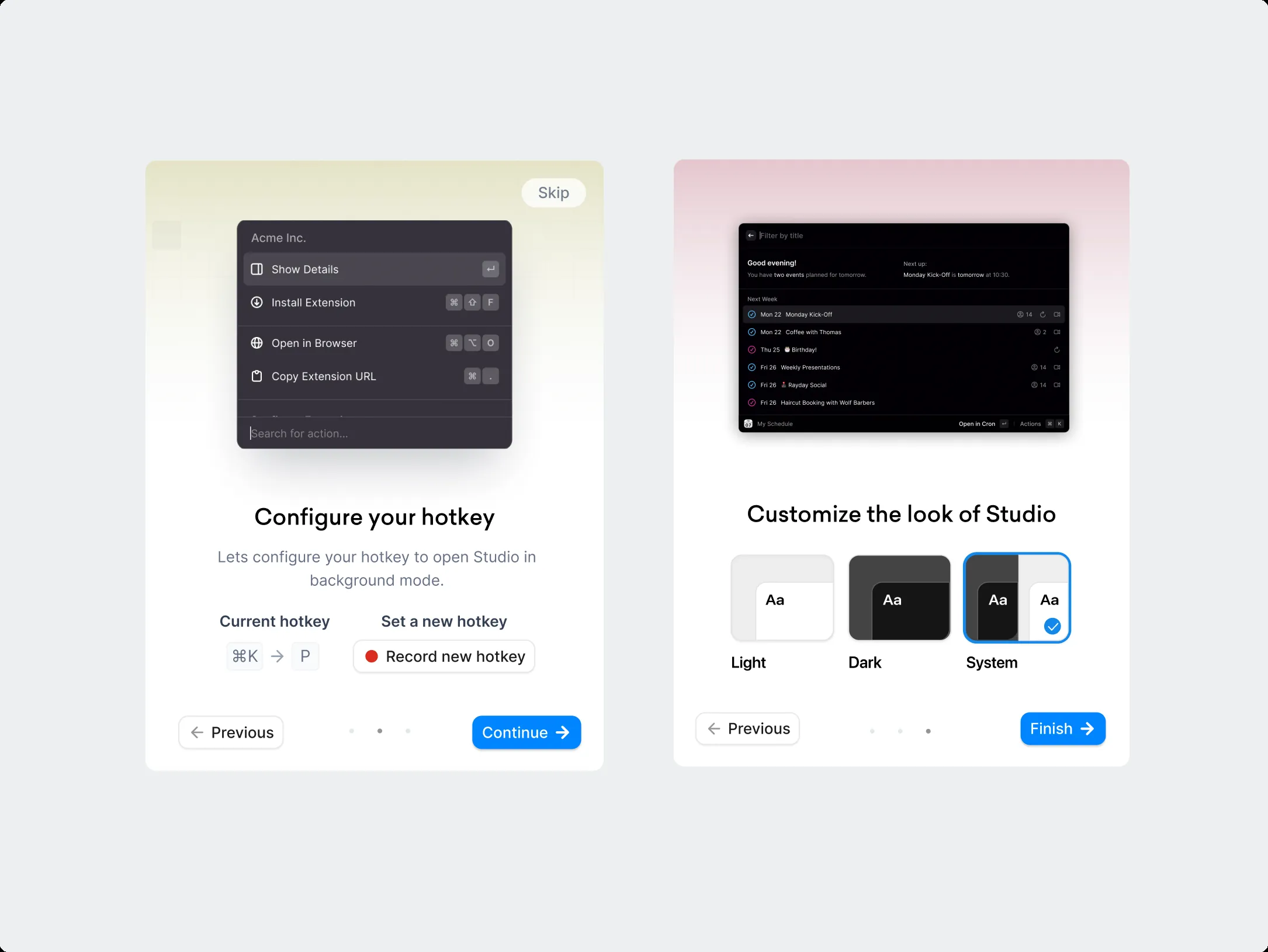
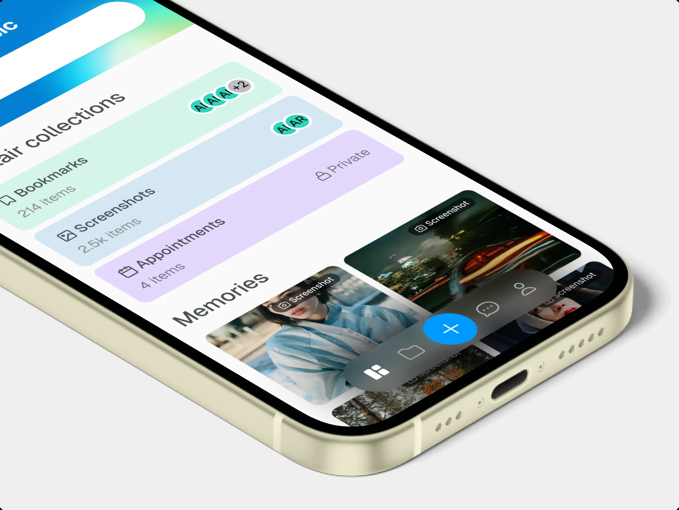
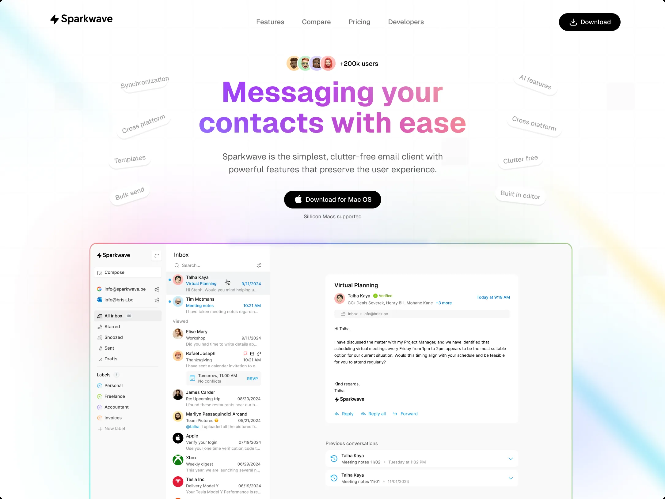
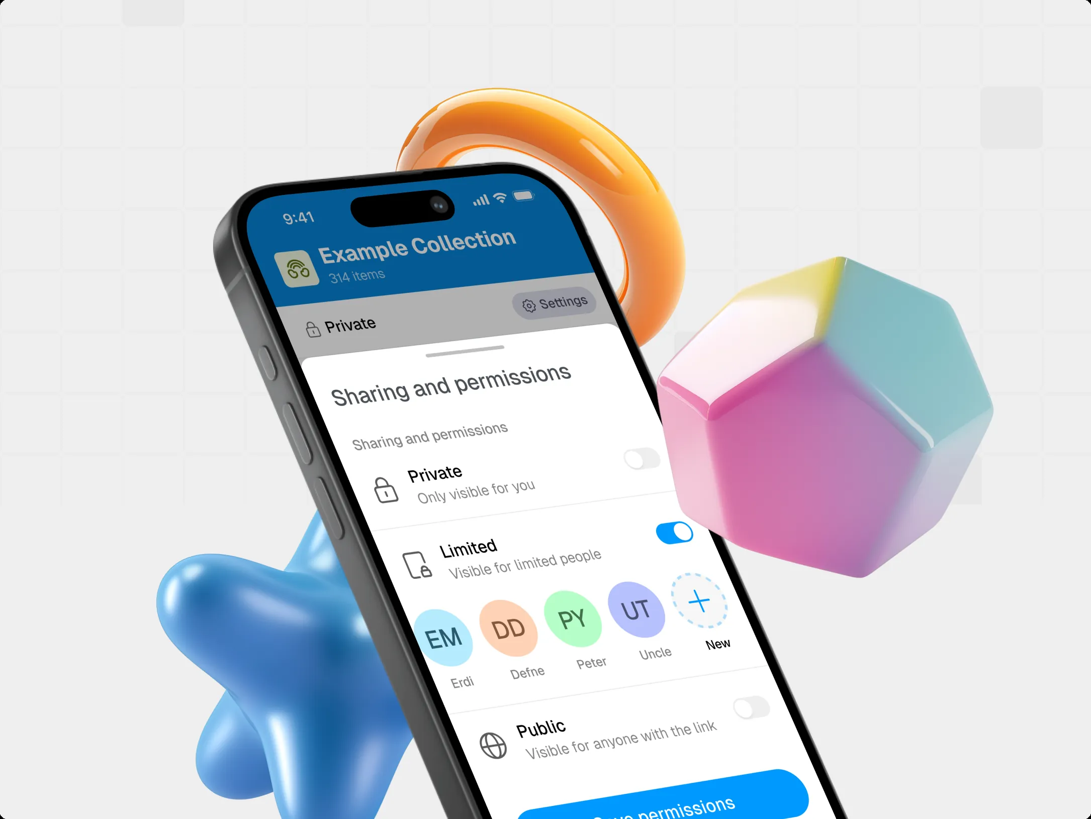
Our work50 designs
Work we designed.
Dashboards, mobile apps, AI products, landing pages and standalone components. Click a design to see it large, zoom in and read about the choices we made.
A selection of client work and concepts. We leave out client names.
12 of 50
What we design. From the first conversation to the last pixel.
Eight disciplines, one team. We start with the people who use your product and finish with screens your developer can build without guesswork.
For SaaS, apps, platforms and dashboards and websites.
Every tile follows the same demo: a bakery’s ordering app.
01UX research
We talk to your users and watch how they work. What we hear, we turn into insights you can base decisions on.
For your developer: User stories and acceptance criteria, straight from the research.
02UX design
Flows and wireframes: what people see, where they tap, what happens when things go wrong. Logic first, looks second.
For your developer: Every flow with all its screens and edge cases: empty, loading and error.
03UI design
The final design: typography, color and details that carry your brand and feel calm.
For your developer: Exact sizes, spacing and tokens in Figma, icons as SVG.
04Design systems
One library of components and rules, so every new screen is right from the start. Across multiple products, too.
For your developer: Tokens as CSS variables, components with variants and states.
05Prototypes
Clickable screens that feel like the real product. You test the idea before a single line of code exists.
For your developer: Every transition with its trigger, duration and easing.
- Example
06Usability tests
Real people do real tasks, and we watch where they get stuck. Then we adjust the design.
For your developer: Findings ranked by priority, with the updated screen.
07Accessibility
Readable contrast, visible focus and tap targets of at least 24 × 24 pixels. So your product works for everyone.
For your developer: WCAG 2.2 AA as the starting point, checked for every component.
08Product strategy workshops
Around the table with your team: goals, users and what to build first. You walk away with a plan.
For your developer: A scope for the first version, with priorities.

One design system. Every screen stays consistent.
A design system is your product’s shared toolkit: colors, typefaces, spacing and components, captured as tokens. Change one token and every screen follows. Try it below.
For your developer: the tokens go into the code as CSS variables or a Tailwind theme. Design and code use exactly the same values.
Design system/Bakkerij Vennegem
Tokens
Contrast per WCAG 2.2 AA
- Text on buttons4.33:1, min. 4.5:1Not enough contrast
- Brand color as text4.33:1, min. 4.5:1Not enough contrast
- Focus ring4.33:1, min. 3.0:1AA passed
Adjusts the lightness of your brand color just enough. The hue stays the same.
Preview of buttons, badges, a form, a card, a notification, a tab bar and table rows using the chosen tokens. Change the tokens to see them update.
Demo · Bakkerij Vennegem/* Design tokens for Bakkerij Vennegem (simplified) */:root { --brand: #b5651d; --brand-foreground: #ffffff; --ring: var(--brand); --radius: 14px; --spacing: 0.25rem; --font-sans: ui-serif, Georgia, Cambria, "Times New Roman", serif; --background: #ffffff; --foreground: #15191b; --muted-foreground: #5e676b; --input: #848c90;}.dark { --background: #111618; --foreground: #eceff0; --muted-foreground: #9aa4a8; --input: #6b777c;}What a design system gives you
- Consistent everywhere
- Every button, form and table looks the same on your website, in your app and in your customer portal. Your users learn your product once.
- Build faster
- Developers build with ready-made components instead of starting every screen from scratch. New screens ship faster, with fewer bugs creeping in.
- Accessible from the ground up
- Contrast, focus rings and keyboard support are built into the components themselves. We start from WCAG 2.2 Level AA, the international guideline for accessible digital design.
- Documented
- Every component comes with when to use it, which variants exist and what it’s called in the code. So the system stays usable as your team or your product grows.
Click through your product before a single line of code exists.
A prototype feels like the real app: you tap, scroll and order. So within a few days you see what works and what doesn’t, while a change still takes an hour instead of weeks of development.


Flow map1 · Overview
Interaction
Overview → Product
- Trigger
- On tap
- Action
- Navigate to Product
- Animation
- Push
- Curve
- Ease out
- Duration
- 300 ms
For your developer: the same values in CSS
transition: transform 300ms cubic-bezier(0.22, 1, 0.36, 1);Tap through the app yourself. Tap next to a button and the hotspots light up, just like in a real prototyping tool.
From wireframe to hi-fi

Structure first, in gray: what goes where, and in what order. Only once the flow works do color, photos and typography come in. So you talk about what it does first, and only then about how it looks.
Every state designed
A screen is more than the pretty picture. We also design loading, fully booked and no connection, so your developer doesn’t have to make anything up and your customer never stares at a blank screen.
Why a prototype
Decide on something tangible
Everyone taps through the same prototype. No more debating what a document meant.
Test with real people
You share a link, testers click through on their own phones. Whatever stumbles, we fix before anything gets built.
How we test with real peopleReady for your developer
Screens, transitions and states are locked in. Your developer builds what you’ve already seen and approved.
Research and testing
Decisions based on people, not on taste.
We talk to your users before we draw anything, and we watch how they actually use the design before a single line of code exists. What they say, where they click and where they get stuck shapes the design. Not what we happen to like.
Switch between the test rounds yourself, or shuffle the notes again.
Our approach
Test small, test often.
You don’t need a big research budget. A few conversations and three short test rounds catch the biggest problems, long before they cost money in code.
- 5testers
- per test roundFive testers already find about 85% of the problems, according to Jakob Nielsen.
- 3rounds
- test and improveThree small rounds beat one big one: after each round we refine the design.
- 4.5:1
- contrast for textThe minimum for regular text in WCAG 2.2 AA. For large text it’s 3:1.
- 24px
- minimum target sizeNew in WCAG 2.2: targets of at least 24 × 24 pixels, or enough space between them.
What we use
- User interviews
- Usability tests, remote or on site
- Click maps and heatmaps
- Analytics and funnels
- Card sorting and tree testing
- UX audit of your existing product
- Accessibility audit
- A/B tests after launch
Accessible from the first sketch
WCAG 2.2 AA is our starting point: contrast, focus, keyboard and screen readers are part of the design, not an afterthought. Since June 28, 2025, the European Accessibility Act applies to many consumer digital services, such as webshops and banking services. Microenterprises that provide services are exempt.
For your developer: every finding becomes a ticket with a screenshot, a severity and a proposed fix. No forty-page report nobody reads.
Sources: Nielsen Norman Group (2000) (opens in a new tab), W3C, WCAG 2.2 (opens in a new tab), European Commission, European Accessibility Act (opens in a new tab), MeasuringU, SUS (opens in a new tab). Checked on September 28, 2026.
Approach
How a design project runs. Step by step, with you in the loop.
Every product is different, so every schedule is too. The order stays the same, though: first understand, then sketch, then polish, then test. After each step you see where things stand and help decide.
A design file with seven frames, one per step, and below them the moments when you’re involved.
Step 1 of 7Kickoff
For each step: what you get, and what we ask of you.
- 01
Kickoff and goals
We get to know your product, your users and your goals. What needs to improve, for whom, and how will we know it worked?
You get
- A short one-page brief
- Goals and success criteria
- A schedule and a fixed price
YouYou tell us about your product and your customers, in a call or a workshop.
- 02
Research and discovery
We talk to real users, look at your data and your existing product, and find where people get stuck.
You get
- Interviews and a UX review
- Insights, clustered by theme
- A list of the biggest pain points
YouYou put us in touch with a few customers or colleagues.
- 03
Flows and wireframes
Structure first, still without color. Which screens, which steps, what goes where. So we talk about the logic, not about taste.
You get
- User flows
- Wireframes of the key screens
- A clickable sketch
YouYou give feedback: does the flow match how your team works?
- 04
UI design and design system
Now it gets beautiful. We design the screens in your brand and build the building blocks at the same time: colors, typography, components.
You get
- Finished screens, desktop and mobile
- A design system with components
- Light and dark mode, if you want them
YouYou help set the direction and approve the screens.
- 05
Prototype and testing
We build a clickable prototype and have real users complete tasks. Whatever doesn’t work, we fix before anything gets built.
You get
- A clickable prototype
- Test results per task
- Changes based on what we saw
YouYou watch the tests with us, or you get the recordings.
- 06
Handoff and build
Our own developers build it, or we hand everything over cleanly to your team. The design files are yours.
You get
- Design files and specs
- Design tokens and components
- Support during the build
YouYou choose: we build it, or your developers do.
- 07
Measure and improve
After launch we look at how people actually use it. Whatever can be better, we tackle in small, focused improvements.
You get
- Metrics for the key steps
- A list of improvements
- New screens as your product grows
YouTogether we decide what comes first.
How long does it take?
That depends on your product. A UX review can take a few days, a new platform takes longer. After the first call you get a schedule and a fixed price.
See pricing
From design to code
From Figma to code, nothing lost in translation.
What we design, we also build. Every button in the design exists as a real component in the code, with the same names, the same variants and the same values. What you approve is what you get.
A button component in a design inspector, the same button in React and Tailwind, and the result in the browser.
Properties
Accessibility
- Contrast 4.97:1AA requires 4.5:1
- Target 40 px tallAA requires 24 × 24
- Focus visiblefocus-visible outline
Pick a variant, size or icon: design, code and result all update together.
One team designs and builds
Our designers and developers work side by side. No handoff over the wall, no “that’s not what we meant”.
Shared design tokens
Colors, spacing and corner radii are defined once, as tokens. The design and the code read the same values.
Documented components
Every component gets its variants and examples laid out, for instance in Storybook. So your team keeps building without guessing.
Accessibility tested in the browser
We check contrast, keyboard, focus and target sizes in the real product, not just in the design.
Pricing
What does product design cost? By the day, or a fixed price.
For an audit, a workshop or a sprint, we work by the day. For a complete design, you get a fixed price after a free call. You always know the amount before we start.
Design consultancy
An experienced designer who thinks along and works alongside you, for exactly as long as you need.
€700
per day · excl. VAT
For example
- A UX audit of your existing product
- A workshop on your product strategy
- A UX review of new screens
- A design sprint, from question to tested prototype
- An accessibility check against WCAG 2.2
- Extra design capacity alongside your own team
Example calculation
Example5 days: €3,500 excl. VAT
Like a 5-day design sprint
Design project
From research to handoff, with one fixed price you get in writing up front.
Fixed price
after a free call · excl. VAT
What’s included
- Research and conversations with your users
- Flows and wireframes
- UI design of every screen, desktop and mobile
- A clickable prototype to test
- A design system with components and tokens
- Handoff to your developers, or we build it
- The design files are yours
What determines the price
- Number of screens and flows
- Web, iOS, Android or all of them
- How much research and testing
- A new design system or building on your existing one
Want us to build it too?
The same team builds what we design. Configure your project and see the price right away.
- All prices excl. VAT
- Amount up front, in writing
- Design files are yours
- 5.0 on Google, from 49 reviews
FAQ
Questions about product design
What founders, product teams and developers ask us most. In plain language, with one line for your developer.
Pricing and timeline
There are two ways. For consultancy, such as an audit, a workshop or a design sprint, you pay €700 per day, excl. VAT. A complete design project gets a fixed price after a free call. Together we look at the number of screens and platforms and how much research is needed, and you get the amount in writing before we start. See pricing
That depends on what you need. Consultancy is booked by the day, so you choose the duration yourself. For a project, you get a schedule after the first call, with set moments when you see the design and give feedback. So you know up front when what will be ready. How a project runs
Less than you think. Tell us what you want to achieve and for whom. If you already have something, we’ll take it into account. You don’t need a detailed brief: we write it together.
- Your goal
- Who your users are
- Your brand identity, if you have one
- Access to your existing product
- Usage data, if you have it
- A deadline, if there is one
Files and building
Yes, we design in Figma. The design files are yours: you get the Figma files with all screens, components and styles, so you or another party can keep working with them later. Just as the code and the data are yours when we build.
Yes. The same team designs and builds: apps, software, websites and webshops. Whoever made the design sits at the table when it gets built, so nothing gets lost along the way. Want to know right away what building costs? Configure your project in the configurator.
Absolutely. Your developers get a design that’s ready to build: a design system with tokens, components with all their states, and clear agreements on spacing and behavior. We walk them through the design and stay available for questions, by the day if needed. From design to code
Audits, accessibility and systems
Yes. We go through your product the way your users do and find where people get stuck. We check it against established usability principles and WCAG, and look at your numbers if you have them. You get an overview of the problems, ranked by impact, with a proposed fix for each. An audit is booked by the day.
Always. We design with WCAG 2.2 Level AA as our starting point: enough contrast between text and background, buttons big enough to hit, a visible focus for keyboard users and error messages that say what’s wrong. Since June 28, 2025, the European Accessibility Act applies in the EU, including to webshops and banking services. Microenterprises that provide services are exempt, but an accessible product is easier for everyone.
Yes, that’s what it’s for. Shared tokens for color, typography and spacing, and one set of components, with its own theme per product or brand. So your teams build faster and everything feels like one whole. Try the design system
Don’t see your question?
Just ask. You’ll get an answer from someone on the team within 24 hours on business days.
Next step
Ready for a product people love to use?
Tell us about your product in a free call. Or email us a link, a few screens or a short description. You’ll get a reply within 24 hours on business days.
Book a free call
30 minutes, online. We listen, ask questions and tell you honestly what we would do.
Pick a timeEmail us your product
Send a link, screenshots or a short description. A rough sketch works too.
info@brisk.be- A fixed price or a clear day rate
- The design files are yours
- One dedicated point of contact
- Designed and built by one team
- A reply within 24 hours on business days
Brisk · Genk, Belgium